Nyyon · Blog
Why We Built Reusable Diagrams Into Our Blog Engine
June 19, 2026
We built diagram and flow generation into our blog engine because basic visuals beat walls of text, and they reuse the build-once principle.
We built reusable diagrams into our blog engine because a wall of text is the weakest way to explain a system. The visual layer was the single biggest change we made to the blog posting service this cycle, and it sticks because it follows a rule we already trust: build the expensive part once, then reuse it everywhere. The diagrams are basic looking right now. Boxes, arrows, flows. They are not pretty. They are much better than nothing, which is exactly what we had before.
That sounds modest. It is not. The decision to ship a plain diagram engine instead of waiting for a polished one is the same call we make on every workflow we build for clients. Get the mechanism live, prove it earns its keep, then refine. The interesting part is not the diagrams. It is the architecture decision underneath them.
The dominant pattern: content as a wall of prose
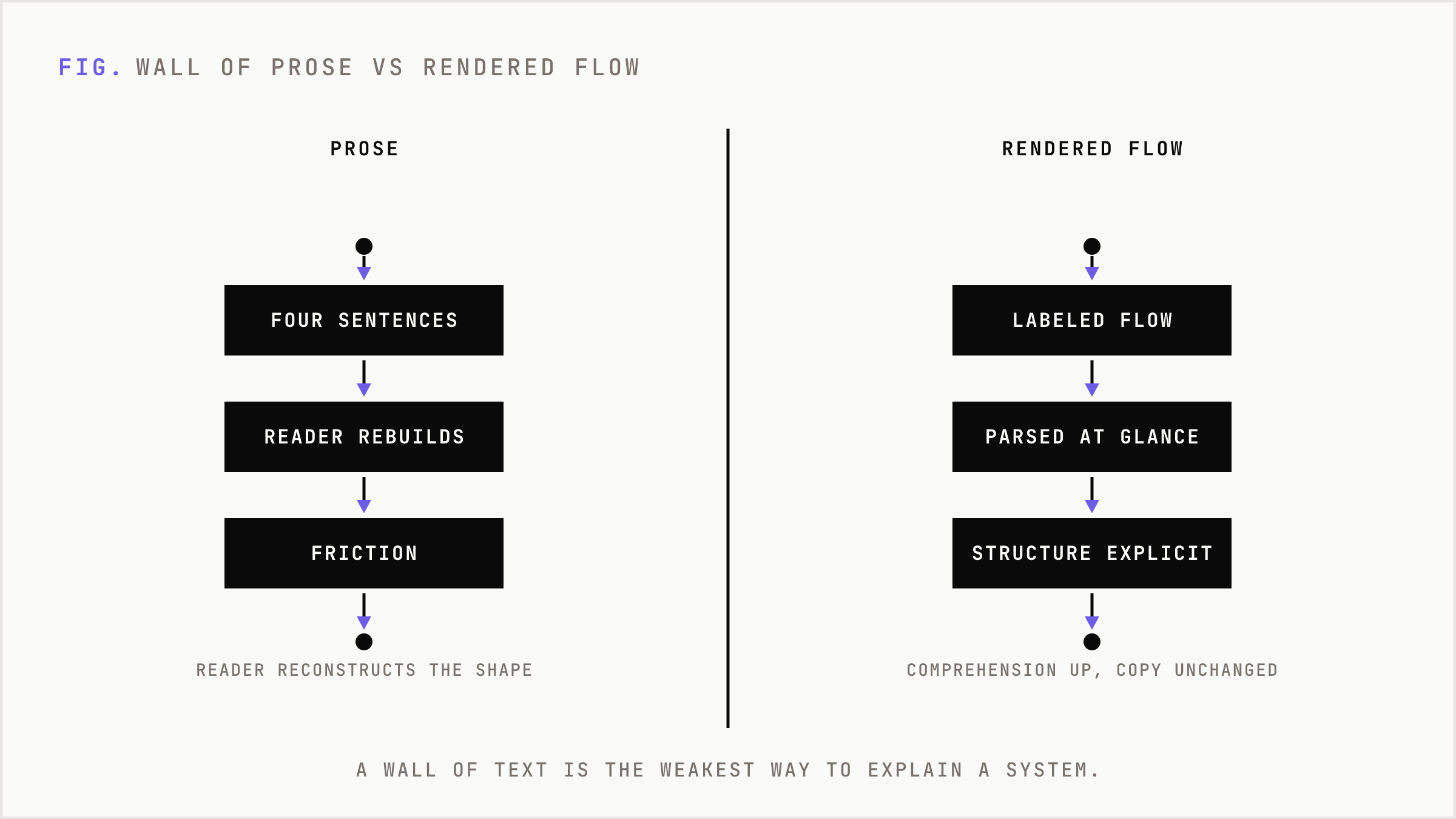
Most marketing content treats explanation as a paragraph problem. You have a process with three gateways and two decision points, and the writer describes it in four sentences. The reader has to reconstruct the shape of the thing in their head. For a senior operator scanning fast, that is friction. For an AI answer engine trying to extract structure, it is worse.
The default fix is to commission a designer. That breaks for an AI-native shop. A designer in the loop turns a same-day post into a three-day post. The visual becomes a bottleneck on the exact thing we optimize for: decision velocity. So most teams skip the visual entirely and ship the wall of prose, or they bolt on a stock illustration that explains nothing.
Both options fail the same test. They treat the diagram as a one-off asset instead of a repeatable output of the system that already writes the post.
The mechanism: gateways, tools, workflows
We built the diagram engine on the same scaffolding we use for everything else. Gateways, tools, workflows.
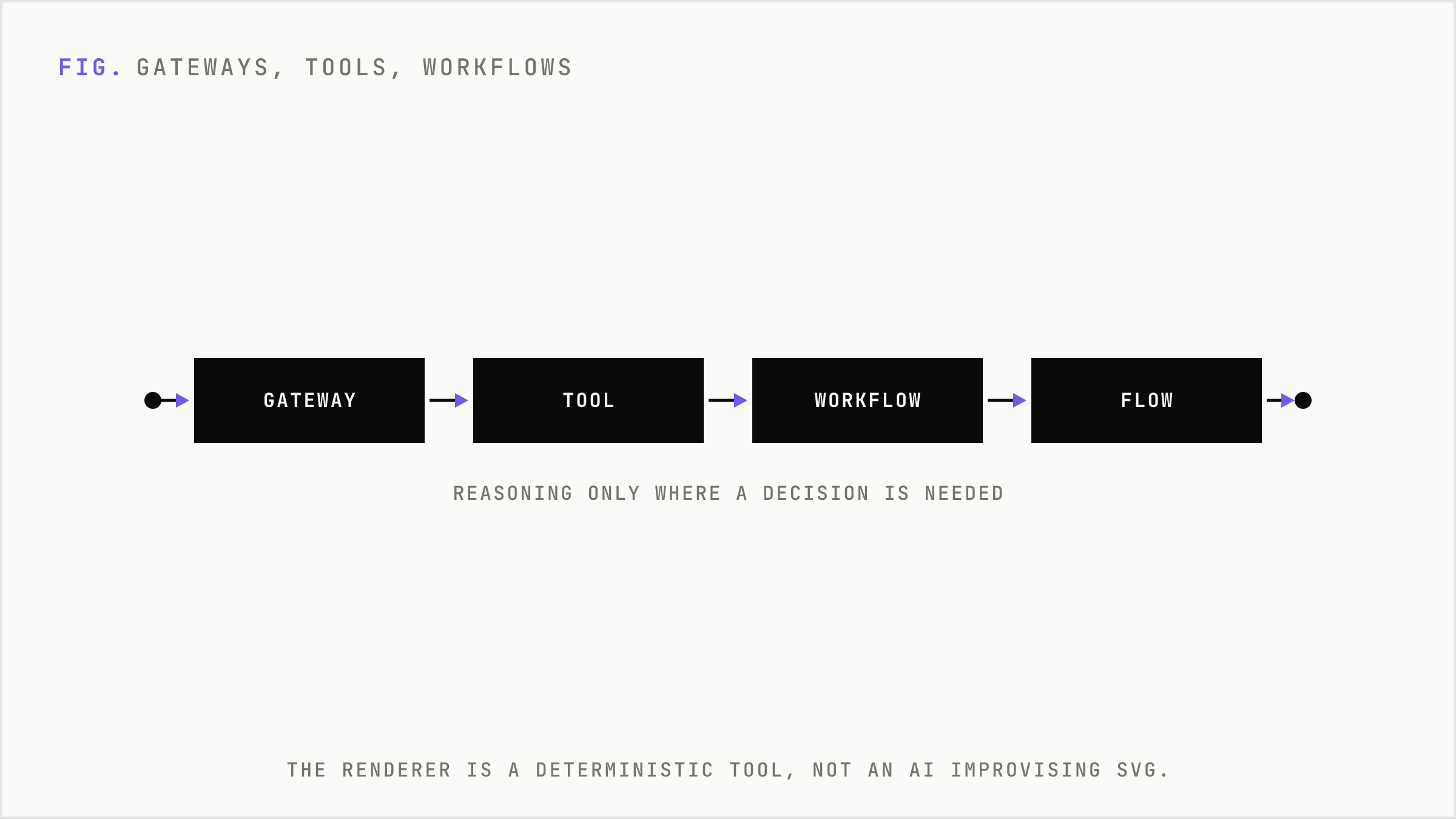
A gateway is a connection to a service the AI can talk to. A tool is a specific thing the AI does with a gateway. A workflow is the fixed chain that uses tools and gateways to reach an outcome.
This model matters because of where it puts the reasoning. Reasoning is expensive. Token spend is real money. So you keep reasoning in the places that genuinely need a decision, and you write plain code everywhere else. The diagram renderer is not an AI improvising SVG on every request. It is a tool. The workflow already understands the structure of the post it just wrote, so it hands that structure to a deterministic rendering tool that produces a flow. Build once, reuse forever, no endless token expenditure to draw the same kind of box twice.
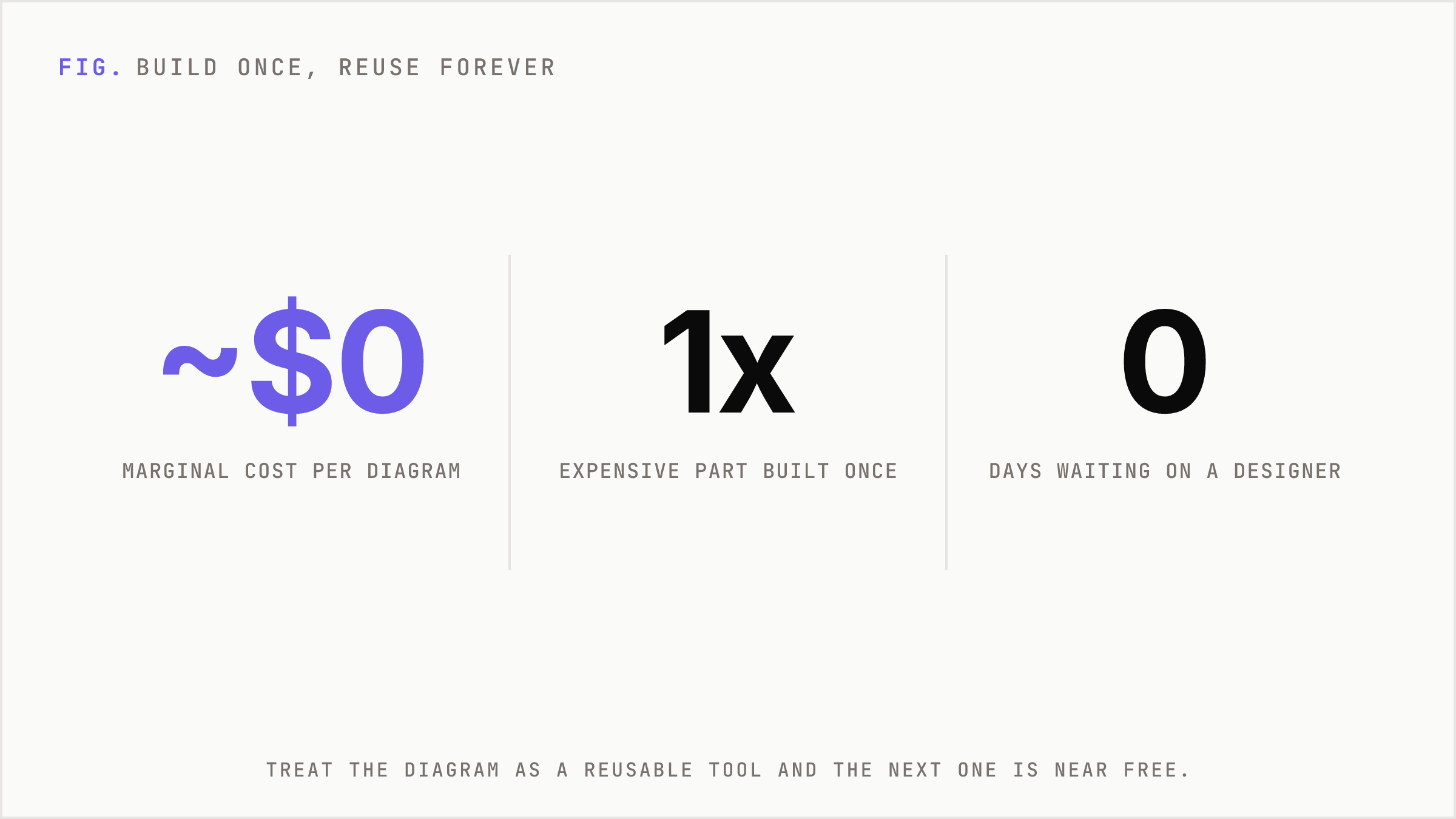
That is the whole point. If we had let the model freestyle a diagram each time, every post would cost more and look different. By treating the diagram as a reusable tool inside the workflow, the marginal cost of the next diagram drops to near zero. The same logic we apply to routing hard tasks to big models and easy tasks to small ones: do not spend reasoning where execution will do.
Why basic and shipped beats polished and pending
The diagrams look basic on purpose. Shipping the plain version is a deliberate choice, not a compromise we are apologizing for.
Here is the consequence, numbered honestly:
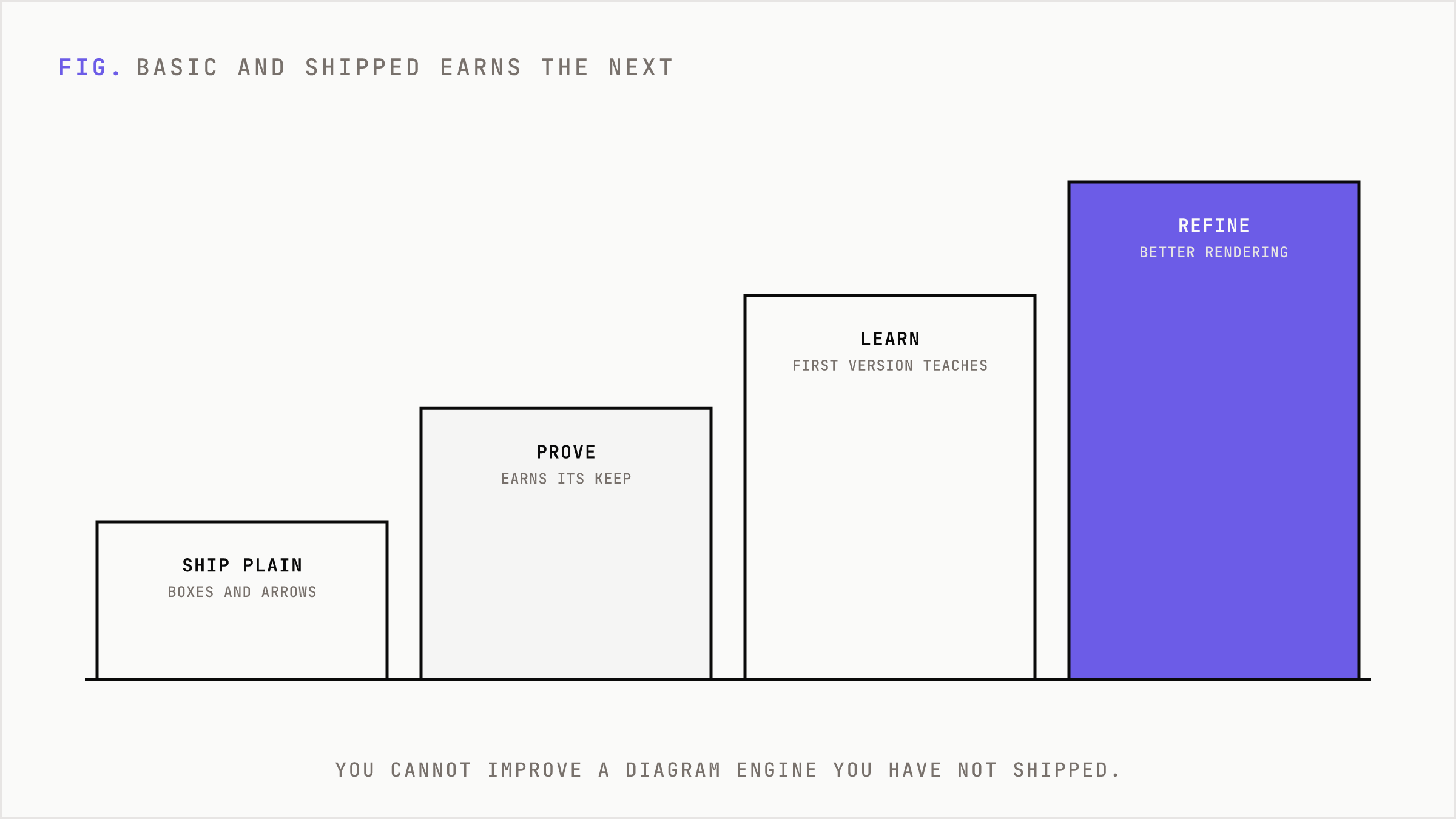
1. A post that used to explain a three-stage workflow in prose now ships with a flow the reader parses in one glance. Comprehension goes up before we change a single word of copy.
2. The visual asset costs almost nothing to produce because it is a tool call, not a design brief. No designer queue, no three-day delay.
3. The first version teaches us what to refine. You cannot improve a diagram engine you have not shipped. The basic version is the precursor that earns the right to a better one.
Compare that to the alternative: waiting until the diagrams are beautiful. That path produces zero diagrams for months and a backlog of posts that explain systems in paragraphs nobody finishes. Worse before nothing.
Diagrams as machine-readable proof
There is a second reason that matters more over time. Structured visuals are easier for answer engines to read than prose.
When you explain a gateway-tool-workflow model in a paragraph, an LLM has to infer the relationships. When you render it as a labeled flow, the structure is explicit. We are moving toward a world where AI confidence in a brand is shaped by organized, machine-readable proof, not by how many adjectives you stack in a sentence. A clean diagram of how your system actually works is a small unit of that proof. It says: this brand can describe its own mechanism precisely enough to draw it.
That is also why the diagram engine sits inside the blog engine rather than beside it. The same workflow that decides what the post argues decides what the post should show. The visual is not decoration added at the end. It is an output of the reasoning.
The build-once principle, applied to everything
The diagram engine is one instance of a broader bet we are making across the agency. Everything we build, we want to break into small reusable building blocks. The WhatsApp digest we shipped is one. The diagram tool is another. Each is a standalone unit that does one thing well and gets reused, the same way a workflow reuses a tool.
This is the difference between a shop that sells hours and a shop that compounds. If every post requires a fresh design effort, you are selling hours. If the post engine produces its own diagrams for free because the capability is wired in once, you are building a spine that throws off leverage on every future post.
The diagrams will get better. That is the part that does not change: we will keep refining the rendering, the styling, the range of flows it can express. What changes is that we no longer ship system explanations as walls of prose and hope the reader rebuilds the shape in their head.
The trade-off is honest. Today the diagrams are plain, and a brand obsessed with pixel-perfect visuals will not be impressed yet. We took that hit deliberately. Basic and live beats gorgeous and theoretical, because only the live version compounds, and only the live version teaches us where to spend the next round of effort.