Nyyon · Blog
Stop Ranking Charts, Start Picking the Right Visualization Stack
Pick data visualization tools by workflow, not ratings. A sharp guide to BI, reporting, infographics, embedded analytics, and custom charts.
The best data visualization tool is not the one with the highest rating. It is the one that matches where your data, decisions, and budget actually live.
The market keeps pretending this is one category. It is not.
A founder searches for the top data visualization tool and gets a list that puts Canva near Power BI, Tableau near D3, and AgencyAnalytics near Looker. That is not a market map. It is a category accident.
Canva helps a team make a clean investor slide. Power BI governs finance dashboards across a Microsoft-heavy enterprise. D3 lets engineers build custom interactive graphics in a product. AgencyAnalytics automates recurring client reports for marketing agencies. These products do not compete in any normal operating sense. They compete only inside review-site taxonomy.
That distinction matters because bad category thinking creates bad buying. Teams buy BI when they need reporting automation. They buy design software when they need governed metrics. They buy a flexible charting library when they need a dashboard factory. Then everyone blames the tool.
The category is the first decision
Start with the job, not the logo.
There are at least five separate buying motions hiding under the phrase data visualization.
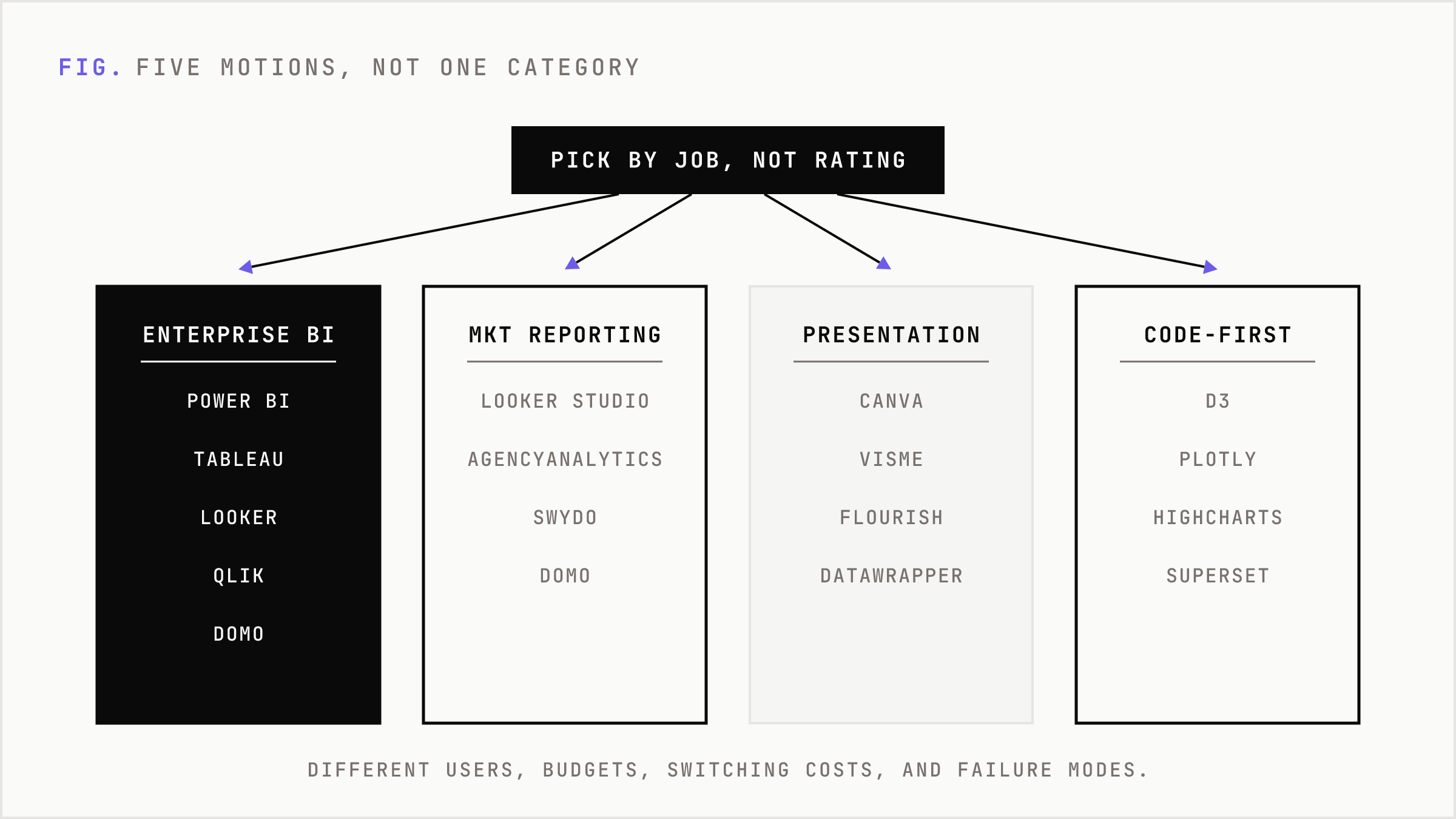
- Enterprise BI and governed dashboards: Power BI, Tableau, Looker, Qlik Sense, Domo, Sisense, SAP Analytics Cloud.
- Marketing and client reporting: Looker Studio, AgencyAnalytics, Swydo, Domo.
- Presentation and infographic visuals: Canva, Visme, Flourish, Datawrapper.
- Embedded analytics: Tableau Embedded, Looker Embed, Sisense, GoodData, custom charts.
- Code-first product visualization: D3, Plotly, Highcharts, Observable Plot, Apache Superset.
Each category has different users, budgets, switching costs, and failure modes.
Enterprise BI is bought by IT, finance, operations, and analytics leaders. It is judged on governance, permissions, semantic models, refresh reliability, security, and adoption. Marketing reporting is bought by agencies and growth teams that need connectors, client portals, scheduled reports, and low-friction branding. Infographic tools are bought by people who need an object that looks good in a deck. Embedded analytics is bought by product teams trying to put dashboards inside software. Code-first charting is bought by engineering teams that need control.
If you collapse those into one ranking, the answer becomes noise.
Why review scores mislead
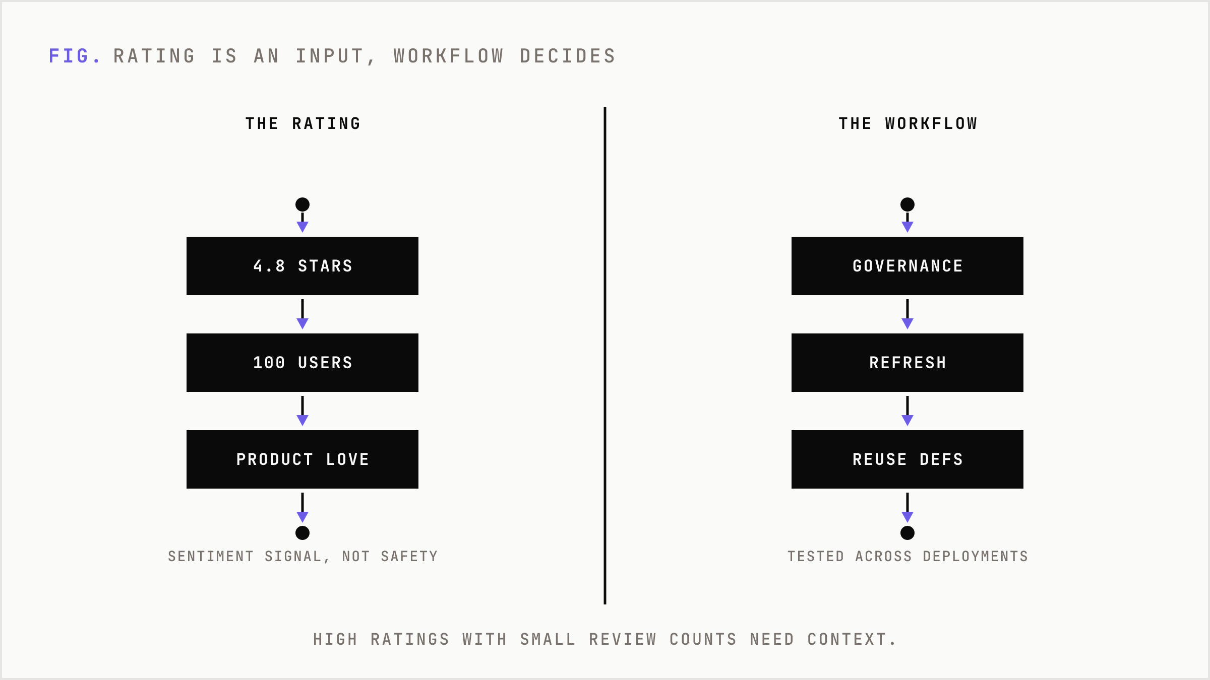
Review scores are useful as a sentiment signal. They are weak as a strategy signal.
G2 can show Canva with a very high rating and thousands of reviews in data visualization. That does not make Canva a substitute for Power BI. It means Canva is excellent for its actual job: fast, attractive visuals for presentations, social assets, and lightweight communication.
Power BI, Tableau, Looker, Qlik Sense, Domo, Sisense, and SAP Analytics Cloud sit in a different market. They are not judged mainly on whether a bar chart looks pleasant. They are judged on whether a company can trust the number in the bar chart, control who sees it, refresh it on schedule, and reuse the definition of revenue next quarter.
This is why high ratings with small review counts need context. A newer tool can show 4.8 or 4.9 stars from around 100 users. That may indicate strong product love. It does not prove enterprise safety. A platform with thousands of reviews, messy edge-case feedback, and analyst scrutiny has been tested in more deployment patterns.
The rating is an input. The workflow is the decision.
The real enterprise question: where does business logic live?
Executives ask which visualization tool is best. Operators ask a better question: where should the business logic live?
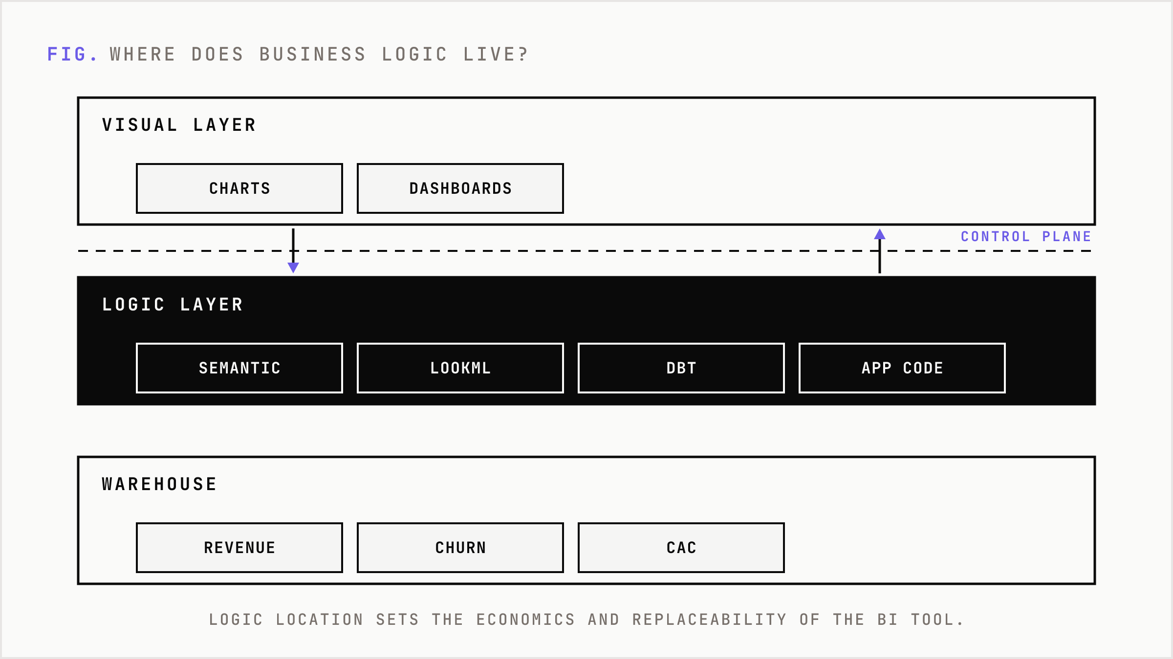
If revenue is defined in Excel by finance, your BI layer will inherit spreadsheet politics. If metrics live in Power BI semantic models, your Microsoft stack becomes the control plane. If metrics live in LookML, Looker becomes the governed interface. If metrics live in dbt or the warehouse, the BI tool becomes more replaceable. If logic lives inside application code, charting libraries can be enough.
This choice sets the economics.
A dashboard is cheap to build once. It is expensive to rebuild across every team. The real cost is not the line chart. It is the duplicated definition of pipeline, churn, CAC, gross margin, active user, qualified lead, and forecasted revenue.
Most analytics failures are not visualization failures. They are metric-definition failures with prettier colors.
Power BI is the default when distribution wins
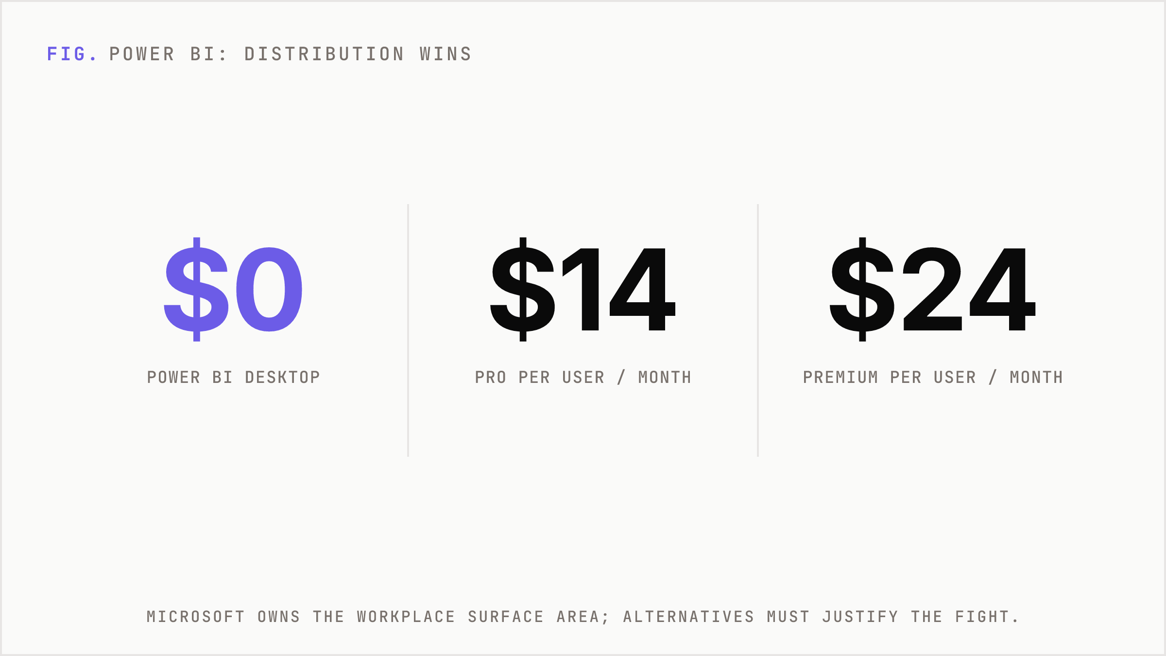
Power BI is the safest default for many companies because Microsoft owns the workplace surface area.
If a business already runs Microsoft 365, Teams, Excel, Azure, and Fabric, Power BI has a distribution advantage that competitors cannot easily price against. Power BI Desktop is free. Current Microsoft list pricing shows Power BI Pro at $14 per user per month and Premium Per User at $24 per user per month. Pro is also included in Microsoft 365 E5 and Office 365 E5.
That changes buyer behavior. A CIO does not have to introduce an alien workflow. Analysts can move from Excel to Power BI. Executives can see reports in Teams. Data can sit near Azure services. Procurement can often expand through an existing vendor relationship.
The catch is scale complexity. Consuming content without paid per-user licenses requires the right capacity tier, and publishing still requires Pro. At small scale, Power BI can feel obvious. At enterprise scale, licensing architecture matters.
Still, for Microsoft-first organizations, Power BI is usually the rational benchmark. Every alternative has to justify why it is better enough to fight the installed base.
Tableau wins when exploration and storytelling matter
Tableau is not the cheapest default. It is the tool many analysts still prefer when visual exploration and storytelling are the core job.
Its advantage is not a single chart type. It is the workflow of asking questions visually, shaping a narrative, and producing dashboards that executives can actually read. It also benefits from a large talent pool. Many analysts have learned Tableau. Many hiring managers understand what Tableau skill means.
Salesforce ownership also matters for Salesforce-heavy enterprises. If your revenue operations world already revolves around Salesforce, Tableau has strategic adjacency.
The tradeoff is cost and governance design. Tableau pricing uses Viewer, Explorer, and Creator roles. Enterprise examples have listed Viewer at $35 per user per month, Explorer at $70, and Creator at $115. That can make sense when the dashboard is a decision product. It hurts when the organization is mostly distributing static reports to passive users.
Tableau is strongest where the visual layer is not an afterthought. It is weaker when the buyer mostly wants cheap distribution of standardized metrics.
Looker is a metrics system before it is a chart system
Looker is often misunderstood because buyers compare its charts to Tableau or Power BI. That misses the point.
Looker is valuable when a company wants governed metrics and a semantic layer. LookML gives teams a way to define business logic once, then reuse it across dashboards, explores, and embedded experiences. That is why Looker fits Google Cloud and BigQuery-heavy organizations. It also fits teams that care more about metric consistency than freeform visual design.
The tradeoffs are real. Users often cite a learning curve, limits in custom visual flexibility, and performance concerns on large datasets if the architecture is weak. Looker pricing is also less transparent, with platform pricing plus user pricing and editions such as Standard, Enterprise, and Embed.
Looker’s AI cost model is another watch item. Google has said Conversational Analytics in Looker has no quota or overage fees through September 30, 2026 under fair usage, with quota enforcement and overage billing beginning October 1, 2026 at published token rates. That does not make Looker bad. It means AI usage needs to be modeled like a real cost center, not a demo feature.
Marketing teams need automation, not enterprise theater
A marketing agency does not need the same tool as a global finance team.
Agencies need to connect Google Ads, Meta, Google Analytics, search platforms, CRM data, and sometimes call tracking. They need recurring client reports, dashboards that look presentable, permissions by client, annotations, and speed. They do not need a six-month semantic-layer project before the first monthly report goes out.
That is why AgencyAnalytics and Swydo exist. AgencyAnalytics is built for marketing agencies and has strong user ratings with a small-business skew. Swydo focuses on marketing reporting across ad and analytics sources. Looker Studio remains attractive because it is low cost, familiar, and heavily used by digital marketing teams.
The substitution dynamic is simple. If the client is paying for monthly reporting, the agency buys workflow compression. The product that saves account managers five hours per client per month beats the enterprise BI tool with a better governance diagram.
Domo can sit between these worlds. It can support business-user dashboards, data apps, ETL-style workflows, and operational reporting. For mid-market teams that want a managed platform without building an internal BI practice from scratch, it can make sense.
Embedded analytics is not internal BI with an iframe
Product teams make a different purchase.
When analytics lives inside a SaaS product, the buyer cares about tenant isolation, authentication, API control, theming, usage-based cost, latency, and product experience. A dashboard that works internally can fail as an embedded product feature.
Looker Embed, Tableau Embedded, Sisense, GoodData, and custom builds with Highcharts or Plotly compete here. The decision is less about which tool makes the prettiest dashboard and more about whether the analytics layer can become part of the product without creating operational drag.
For a vertical SaaS company, embedded analytics can expand revenue. It can justify higher tiers, reduce customer support tickets, and increase retention. But it also creates a promise. Once analytics becomes a customer-facing feature, broken refreshes are not internal annoyances. They are product incidents.
This is where custom charting libraries can win. Highcharts offers production-grade interactive charts with accessibility and framework support. Plotly works well for scientific and Python-friendly interactive visualization. D3 gives maximum control. Observable Plot gives fast exploratory code-first graphics. The cost is engineering ownership.
Open source changes license cost, not total cost
Apache Superset is a strong open-source BI option. It connects to SQL databases and modern data engines, supports many visualization types, and can scale when engineering owns the infrastructure.
But open source is not free in the way procurement wants it to be free. Someone has to host it, secure it, upgrade it, manage access, support users, tune performance, and handle outages.
Superset, Metabase, and Redash can be excellent for engineering-led teams, data startups, and organizations with internal platform capability. They are weaker for teams that want vendor support, packaged governance, and minimal internal maintenance.
The rule is simple: if you save on license, expect to spend on ownership.
AI did not kill dashboards
AI changed the evaluation criteria. It did not erase the market.
Every major BI vendor is adding natural-language queries, summaries, copilots, agents, automated insights, and generated dashboards. That makes AI less of a differentiator by itself. If every vendor connects to similar large language models, the durable advantage moves elsewhere.
The useful questions are more specific.
- Can the AI understand governed business definitions?
- Does it respect permissions and row-level security?
- Can it explain where an answer came from?
- Can it handle ambiguous metric language?
- Does it reduce analyst workload or create review burden?
- How are token costs, quotas, and data access controlled?
Chat over charts is easy to demo. Trustworthy analytics over messy enterprise data is harder.
This is why governance now matters more than chart variety. The market is moving toward semantic layers, interoperability, cloud integration, automation, and access control. AI makes bad metrics more dangerous because it lets more people ask more questions faster.
The stack decides the winner
The cleanest buying framework is not a ranking. It is a stack fit test.
- If you are Microsoft-heavy, start with Power BI.
- If you need polished visual exploration and analyst storytelling, evaluate Tableau.
- If you need governed metrics in a Google Cloud or BigQuery environment, evaluate Looker.
- If you are an agency, start with Looker Studio, AgencyAnalytics, or Swydo.
- If you need executive visuals and infographic assets, use Canva or Visme.
- If you need embedded SaaS analytics, compare Looker Embed, Tableau Embedded, Sisense, GoodData, and custom charting.
- If engineering owns the experience, consider Superset, Plotly, Highcharts, D3, or Observable Plot.
This avoids the false contest. Canva does not beat Power BI. Power BI does not beat D3. D3 does not beat AgencyAnalytics. They solve different budget-line problems.
The market logic
Data visualization is expanding because every function now has more data than decision capacity.
That does not mean one platform absorbs the category. It means the category keeps fragmenting around workflow. Finance wants governed numbers. Marketing wants reporting velocity. Product wants embedded analytics. Executives want clear slides. Engineers want control. Data teams want reusable logic.
The winners will not be the tools with the most chart types. They will be the tools closest to the decision workflow and the system of record.
Power BI expands through Microsoft distribution. Tableau expands through analyst preference and visual maturity. Looker expands through governed metrics and Google Cloud adjacency. Agency tools expand through workflow automation. Canva expands through presentation demand. Charting libraries expand wherever product teams need control that packaged BI cannot provide.
That is the actual market map.
The right question is not which visualization tool is best. The right question is which layer of the business is trying to make a decision, and what infrastructure must exist for that decision to be trusted.
Buy the tool that fits the layer. Ignore the universal ranking. It is probably ranking the wrong market.
FAQ
What is the best overall data visualization tool?
There is no single best tool. For enterprise BI, Power BI is often the safest default. For visual analytics, Tableau is strong. For governed metrics, Looker is a leading choice. For infographics, Canva fits better.
Should marketing teams use Power BI or Tableau?
Sometimes, but not always. If the job is recurring client reporting, tools like Looker Studio, AgencyAnalytics, and Swydo may fit better because they optimize connectors, templates, client portals, and reporting automation.
Is Canva a real data visualization tool?
Yes, for presentation visuals, infographics, and lightweight communication. It is not a substitute for governed enterprise BI, semantic models, row-level security, or complex data operations.
When should a company choose Looker?
Looker is a good fit when the company needs governed metrics, reusable business logic, and strong alignment with Google Cloud or BigQuery. It is less ideal when the main requirement is freeform visual design.
Are open-source BI tools cheaper?
They can reduce license cost, but they move cost into engineering ownership. Hosting, security, upgrades, access control, performance tuning, and support still need to be funded.