Nyyon · Blog
The Marketing Leader’s Field Guide to Choosing BI That Actually Drives Decisions
A clear framework for choosing BI tools by ecosystem, governance, AI readiness, workflow impact, and the real cost of better decisions.
The best BI tool is not the one with the best dashboard. It is the one that turns messy commercial data into trusted decisions faster than the organization can create new questions.
That distinction matters because most BI buying still starts in the wrong place. A marketing leader sees a board deck problem, a reporting backlog, or a set of paid media dashboards that nobody trusts. The team evaluates tools by screenshots. Finance asks about license cost. IT asks about security. The CMO asks whether the tool has AI.
All of those questions are valid. None is sufficient.
BI is now a systems decision. It touches the data warehouse, CRM, ad platforms, attribution model, finance definitions, sales pipeline stages, campaign taxonomy, user permissions, and the operating rhythm of the business. A dashboard tool bought as a reporting shortcut quickly becomes a decision layer. If that layer is weak, every AI feature built on top of it becomes a faster way to spread bad numbers.
The market has moved past dashboards
The old BI category was simple. Pull data in, build charts, publish dashboards. That market still exists, but it is no longer where the leverage is.
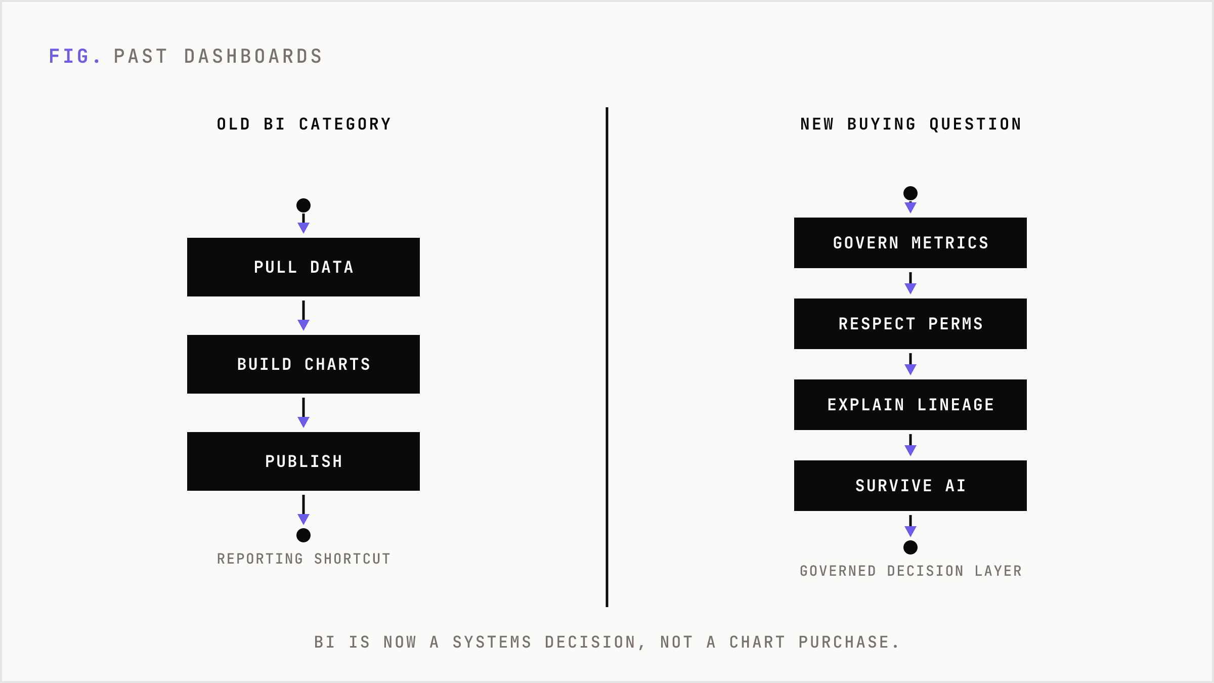
The new buying question is harder: which platform can govern metrics, answer follow-up questions, respect permissions, explain lineage, trigger workflows, and survive AI-assisted analysis?
Gartner’s recent analytics and BI framing points in the same direction: cloud integration, governance, interoperability, and AI automation now matter as much as visualization. The leader set reflects that shift: Microsoft, Google Looker, Oracle, Qlik, Salesforce Tableau, and ThoughtSpot are not just competing on charts. They are competing to own the governed interface between people, data, and action.
For marketing, this is not abstract. Marketing data is structurally dirty. Paid media platforms grade their own homework. GA4 does not match CRM. CRM does not match finance. Leads, MQLs, opportunities, pipeline, CAC, payback, and attribution all depend on definitions. A BI tool cannot fix that by making the chart prettier.
Start with the job, not the vendor
A marketing BI system usually has five jobs.
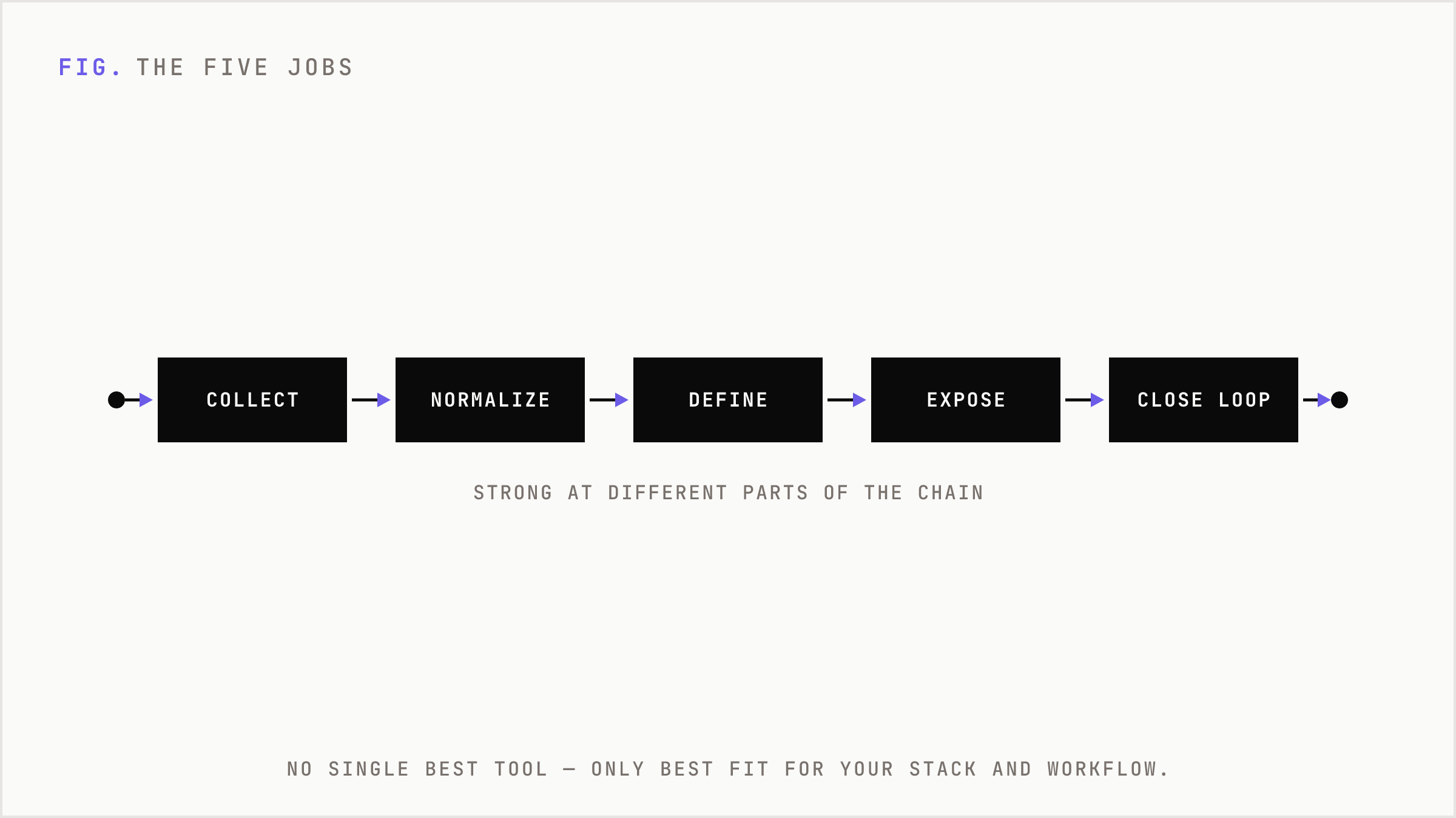
- Collect data from ads, web analytics, CRM, lifecycle tools, finance, product, and sales systems.
- Normalize the mess so campaigns, channels, regions, products, and accounts line up.
- Define metrics so revenue, pipeline, CAC, conversion, and retention mean the same thing everywhere.
- Expose answers in dashboards, workbooks, natural language, alerts, and embedded workflows.
- Close the loop by pushing decisions back into budget, sales follow-up, lifecycle automation, and planning.
Different tools are strong at different parts of that chain. That is why there is no single best BI solution. There is only the best fit for your stack, governance maturity, users, and decision workflow.
Power BI is the default for a reason
For most companies, the default answer is Microsoft Power BI. Not because it is perfect. Because it is easy to justify.
If the company already runs Microsoft 365, Teams, Excel, Azure, and increasingly Fabric, Power BI slides into existing procurement and user behavior. Pro pricing has historically been far below premium enterprise BI seats. The skill market is large. Finance teams already understand Excel-shaped analysis. Executives can get reports without introducing a new vendor religion.
The trap is assuming entry price equals total cost. Power BI becomes more complex at scale. The real budget line includes Pro or Premium Per User licenses, Fabric capacity, broad consumption thresholds, Copilot capacity requirements, refresh constraints, DAX expertise, semantic model design, and governance overhead.
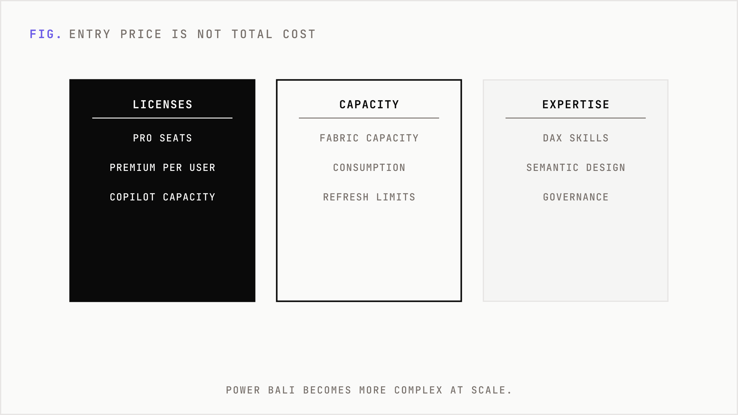
Power BI wins when BI is an adoption problem. It loses ground when the company needs cloud neutrality, deeply governed cross-cloud semantics, or a front-end experience built around visual storytelling rather than Microsoft ecosystem gravity.
Tableau still owns premium visual analytics
Tableau remains the premium brand for visual analysis and executive storytelling. That matters when analytics is not just internal plumbing. Board reporting, customer-facing insight, sales leadership reviews, investor updates, and revenue-room storytelling all benefit from visual polish and analyst fluency.
Salesforce has pushed Tableau toward a broader workflow future: Tableau Next, Tableau Agent, Pulse, trusted semantics, Data 360, Slack, and Agentforce-style integration. The point is not just better dashboards. The point is analytics closer to customer workflows.
That is the right direction. Tableau is harder to justify when the job is basic internal reporting at the lowest possible cost. It is easier to justify when insight presentation affects revenue behavior, executive confidence, or customer experience.
Looker is a governance product wearing a BI jacket
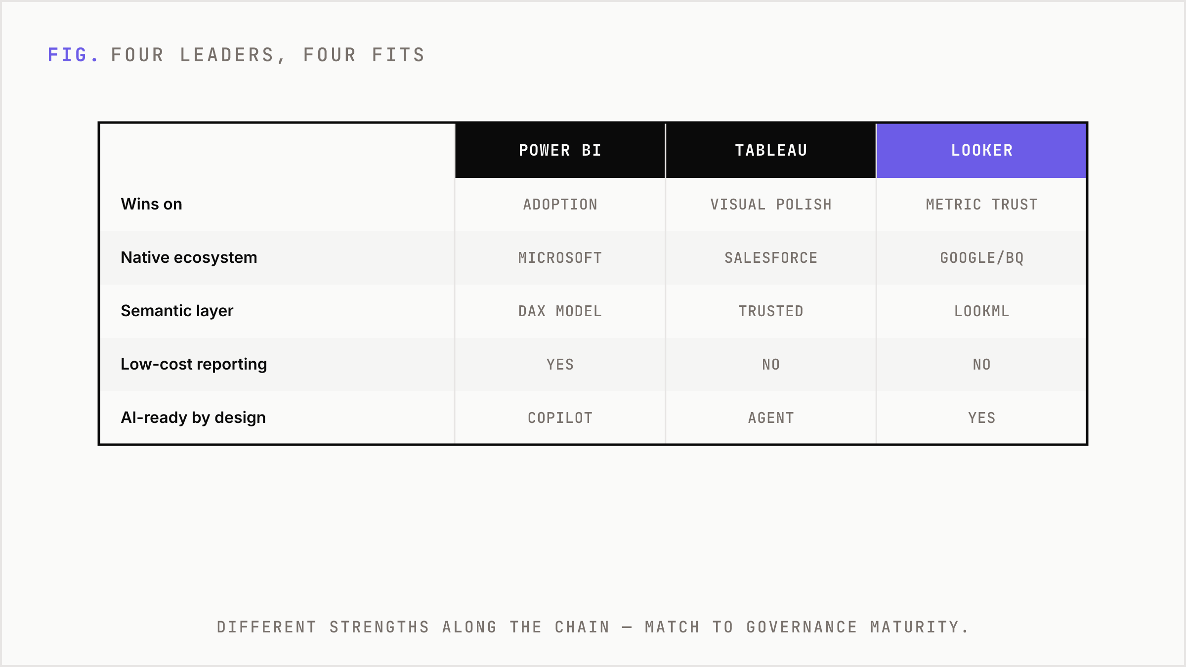
Looker is the best fit when the real problem is metric trust. It is especially strong in Google Cloud and BigQuery environments, but its deeper value is LookML: a code-based semantic layer that forces teams to define business logic centrally.
That discipline is either the whole point or the bottleneck.
If sales, marketing, finance, and product argue every week about whose pipeline number is real, Looker can create leverage. Definitions live in governed models. Metrics become reusable. Permissions and logic can be maintained with engineering rigor.
If the company wants fast drag-and-drop dashboards without modeling discipline, Looker can feel slow. But AI changes the math. Natural-language analytics depends on semantic context. If an LLM does not know what qualified pipeline means, who can see it, and which tables are certified, it will produce confident nonsense. Looker is strong in an AI future precisely because it asks for structure before speed.
Qlik is built for ugly data exploration
Qlik is under-discussed because it does not always win the screenshot contest. Its strength is discovery.
The associative model indexes loaded data so users can explore relationships without being locked into preset query paths. That matters when the business does not know the exact question upfront. Marketing teams often live there: why did conversion drop in one segment, why did paid search efficiency improve while pipeline quality fell, why did one region outperform after budget was cut?
Qlik is a better discovery engine than a simple dashboard factory. It fits complex, messy, multi-source environments where exploration matters more than static KPI distribution. The evaluation questions are practical: cloud strategy, in-memory architecture, governance model, skill availability, and how well Qlik’s automation and integration features fit the existing data stack.
ThoughtSpot is the cleanest bet on natural-language BI
ThoughtSpot is closest to the BI-as-AI-analyst narrative. Its product center is search and conversational analysis, not dashboard browsing. Users ask questions, drill into answers, generate Liveboards, and investigate patterns without waiting for an analyst to build another report.
That is useful when dashboard adoption is low. It is also useful when business users have many small questions that never make it into the analytics backlog: which campaigns drove expansion pipeline last quarter, which accounts increased product usage before converting, which regions show rising acquisition cost with falling close rates?
The risk is the same as with every AI analytics system. Natural language is not magic. It needs governed data, permission-aware access, metric definitions, and auditability. ThoughtSpot becomes powerful when semantic truth already exists. Without that, it only makes confusion more interactive.
Sigma attacks the spreadsheet export problem
Every BI leader knows the failure pattern. The dashboard launches. Stakeholders nod. Then they export to Excel and do the real work somewhere else.
Sigma attacks that behavior directly. It gives business teams a spreadsheet-like interface on live cloud warehouse data, with no extract-first workflow. It works well for Snowflake, Databricks, and BigQuery-centered teams that want governed analysis without forcing every operator to become a SQL analyst.
This is especially relevant for finance, revenue operations, sales operations, planning, and marketing performance teams. These groups do not just read charts. They filter, pivot, model scenarios, adjust plans, and often need writeback. Sigma’s value is not anti-spreadsheet. It is spreadsheet-native work on governed warehouse data.
The hidden cost is warehouse usage. If users run heavy live queries all day, the BI bill is only part of the economic picture.
QuickSight is BI as AWS infrastructure
Amazon QuickSight, now positioned within the broader Quick Suite direction, is strongest when BI is embedded into AWS-native products and applications. It is not usually the first pick for a marketing team that wants the richest analyst experience. It is a cost and infrastructure play.
Reader pricing and session-based embedded economics can be compelling for large audiences. If a SaaS product wants to show analytics to thousands of customer users, per-seat BI math can break quickly. QuickSight’s serverless model, AWS identity integration, row-level security, encryption, and embedding options make sense when analytics is part of the product surface.
For internal marketing BI, it is a fit when the company already builds deeply on AWS and values infrastructure alignment over analyst preference.
Domo is for teams that need outcomes before architecture
Domo is useful when the company lacks a mature data stack and needs one platform to connect data, transform it, dashboard it, automate against it, and push workflows forward.
That is not architectural purity. It is operational pragmatism.
Mid-market marketing, sales, retail, and services teams often need speed more than an elegant warehouse-plus-dbt-plus-semantic-layer roadmap. Domo gives them connectors, ETL, dashboards, alerts, workflows, embedded analytics, AI features, and low-code apps in one commercial package.
The tradeoff is lock-in and consumption pricing complexity. Domo is less attractive for companies already standardized on Snowflake, dbt, Fabric, Looker, or another governed data platform. It is more attractive when the alternative is six quarters of roadmap and no operating visibility.
Looker Studio is not Looker, and that is fine
For agencies and lightweight marketing reporting, Looker Studio remains useful because it is fast, cheap, and familiar. GA4, Search Console, Google Ads, Sheets, and common marketing connectors cover a lot of everyday reporting.
It is not enterprise Looker. It is not a governed semantic BI platform. It should not be treated like one.
Looker Studio is enough for client dashboards, SEO reporting, paid media summaries, lightweight portals, and early-stage performance visibility. It breaks when the organization needs complex permissions, certified metric definitions, cross-functional governance, auditability, and mission-critical executive reporting.
The real cost is not the license
BI budgets are usually misread because buyers overfocus on seat price. The larger cost sits elsewhere.
- Warehouse compute from live querying, refresh schedules, and data volume.
- Implementation work across connectors, identity, security, row-level access, and data modeling.
- Governance work around definitions, lineage, certification, ownership, and metric change control.
- Adoption work around training, dashboard retirement, stakeholder alignment, and operating cadence.
- AI costs from capacity, tokens, question volume, audit review, and permission design.
This is why cheap BI can become expensive and expensive BI can be rational. A low license price does not help if every revenue meeting still starts with a debate about whose number is right.
A decision framework for marketing leaders
Use ecosystem gravity first. Microsoft-heavy companies should start with Power BI. Google Cloud and BigQuery teams should look hard at Looker. Salesforce-heavy go-to-market organizations should evaluate Tableau and Tableau Next. AWS-native product teams embedding analytics should evaluate QuickSight. Snowflake-heavy and Excel-heavy operators should look at Sigma.
Then use workflow. If the team needs polished executive storytelling, Tableau has an edge. If the problem is metric consistency, Looker belongs in the conversation. If analysts need to find unknown relationships across messy data, Qlik is relevant. If business users want to ask questions in plain language, ThoughtSpot is a serious contender. If the business needs all-in-one dashboards plus workflows, Domo is practical. If the work is agency-style marketing reporting, Looker Studio may be enough.
Finally, use maturity. Spreadsheet chaos needs basic structure. Department dashboards need adoption. Governed metrics need semantic modeling. Self-service needs permissions and reusable definitions. Operational BI needs workflow integrations. Agentic BI needs all of the above, plus auditability.
The strategic implication
BI tools are converging on AI, but AI does not remove the hard parts. It exposes them.
Dashboards are becoming less differentiated. The durable advantage is the governed decision system underneath: clean data models, shared metric definitions, permission-aware access, business process integration, and a feedback loop from insight to action.
For marketing leaders, the goal is not more dashboards. It is shorter decision cycles, fewer manual reporting hours, higher trust in certified metrics, better self-service success, and more actions triggered from insight.
Choose the tool that compounds those outcomes. Everything else is interface.
FAQ
What is the best BI tool for most marketing teams?
Power BI is the best default for many companies, especially Microsoft-heavy organizations. It is widely adopted, relatively easy to justify commercially, and familiar to Excel-centered teams. It is not automatically best for every stack or workflow.
When should a marketing team choose Looker instead of Power BI?
Choose Looker when metric governance is the central problem, especially in Google Cloud or BigQuery environments. If teams argue about definitions for pipeline, CAC, revenue, or active users, Looker’s semantic modeling discipline can create long-term leverage.
Is Tableau still worth paying for?
Yes, when visual analysis, executive storytelling, analyst experience, or Salesforce workflow proximity matters. It is harder to justify for basic internal dashboards where cost and broad adoption are the primary criteria.
Which BI tool is best for AI and natural-language analytics?
ThoughtSpot is the strongest pure play for natural-language and search-first analytics. Power BI Copilot, Gemini in Looker, Tableau Next, and Qlik also have AI directions, but all depend on governed data and clear metric definitions.
Is Looker Studio enough for marketing reporting?
Often, yes. Looker Studio is useful for agencies, SEO dashboards, paid media reporting, GA4, Search Console, Google Ads, and lightweight client dashboards. It is not a replacement for enterprise BI governance.
What is the biggest hidden cost of BI?
The biggest hidden cost is usually not the license. It is data modeling, governance, warehouse compute, implementation, training, dashboard sprawl, and the organizational work required to make people trust and use the numbers.