Nyyon · Blog
From Dashboards to Decisions: The Marketing Leader’s Guide to Data Visualization Tools
A sharp guide to choosing data visualization tools for marketing teams, from BI dashboards and AI analytics to storytelling platforms and custom charts.
The best data visualization tool is the one that shortens the distance between a question, a decision, and a measurable change in behavior.
Most marketing teams do not have a visualization problem. They have a decision system problem. The dashboard is the visible surface. Under it sits the real machinery: data contracts, metric definitions, access rules, refresh logic, budget owners, campaign operators, and executives who want a clean answer by 8 a.m.
That is why the tool market looks crowded but behaves rationally. Excel, Power BI, Tableau, Looker, Sigma, ThoughtSpot, Flourish, Datawrapper, Superset, Metabase, D3, Plotly, Grafana. These are not interchangeable products with different skins. They are responses to different jobs.
A board deck, a daily paid media dashboard, a public benchmark report, and a custom product chart are different purchases. They sit in different budget lines. They are owned by different teams. They decay at different speeds. They create different kinds of leverage.
The seven jobs hiding inside one category
Data visualization tools fall into seven practical jobs.
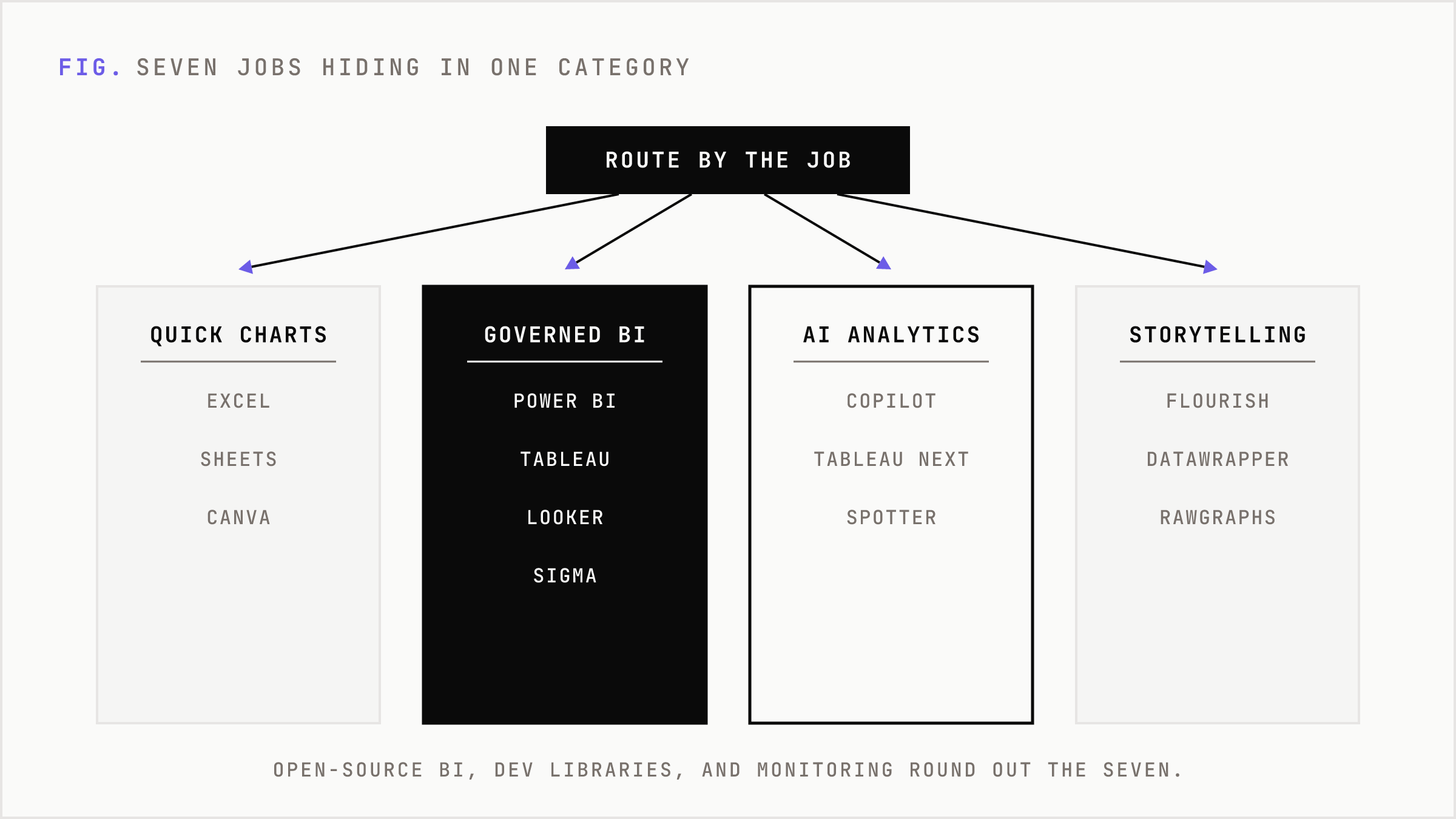
First, quick charts. Excel, Google Sheets, and Canva are still the first line of analysis because they are already installed, familiar, and fast. They are not elegant governance systems. They are the workbench.
Second, governed BI dashboards. Power BI, Tableau, Looker, Qlik, Sigma, ThoughtSpot, Domo, Oracle Analytics, SAP Analytics Cloud, and Zoho Analytics serve organizations that need permissions, semantic models, scheduled refreshes, enterprise sharing, and some control over metric sprawl.
Third, AI assisted analytics. Power BI Copilot, Tableau Next, Gemini in Looker, Qlik Answers, Sigma Assistant, ThoughtSpot Spotter, and Metabase AI are all trying to make the interface less like a dashboard gallery and more like a question box. The value is not the chat window. The value is whether the system can translate a question into trusted logic.
Fourth, no-code storytelling. Flourish, Datawrapper, and RAWGraphs help teams publish clear visual narratives without building a BI program. They win when the output is a report, landing page, article, or public explainer.
Fifth, open-source BI. Apache Superset, Metabase, and Evidence reduce license dependency and give technical teams more control. The cost does not vanish. It moves from vendor contracts to hosting, modeling, security, and maintenance.
Sixth, developer chart libraries. D3, Plotly, Observable Plot, Chart.js, Apache ECharts, Matplotlib, Seaborn, ggplot2, and Altair are for teams that need custom interaction, statistical rigor, notebooks, embedded charts, or a visual experience that is part of the product.
Seventh, operational monitoring. Grafana and Kibana are not marketing dashboard tools in the classic sense. They are built for systems, logs, metrics, alerting, and real-time operational state. When the question is whether something is breaking right now, they beat a polished quarterly dashboard.
Marketing does not need one dashboard
A serious marketing function needs three visualization layers.
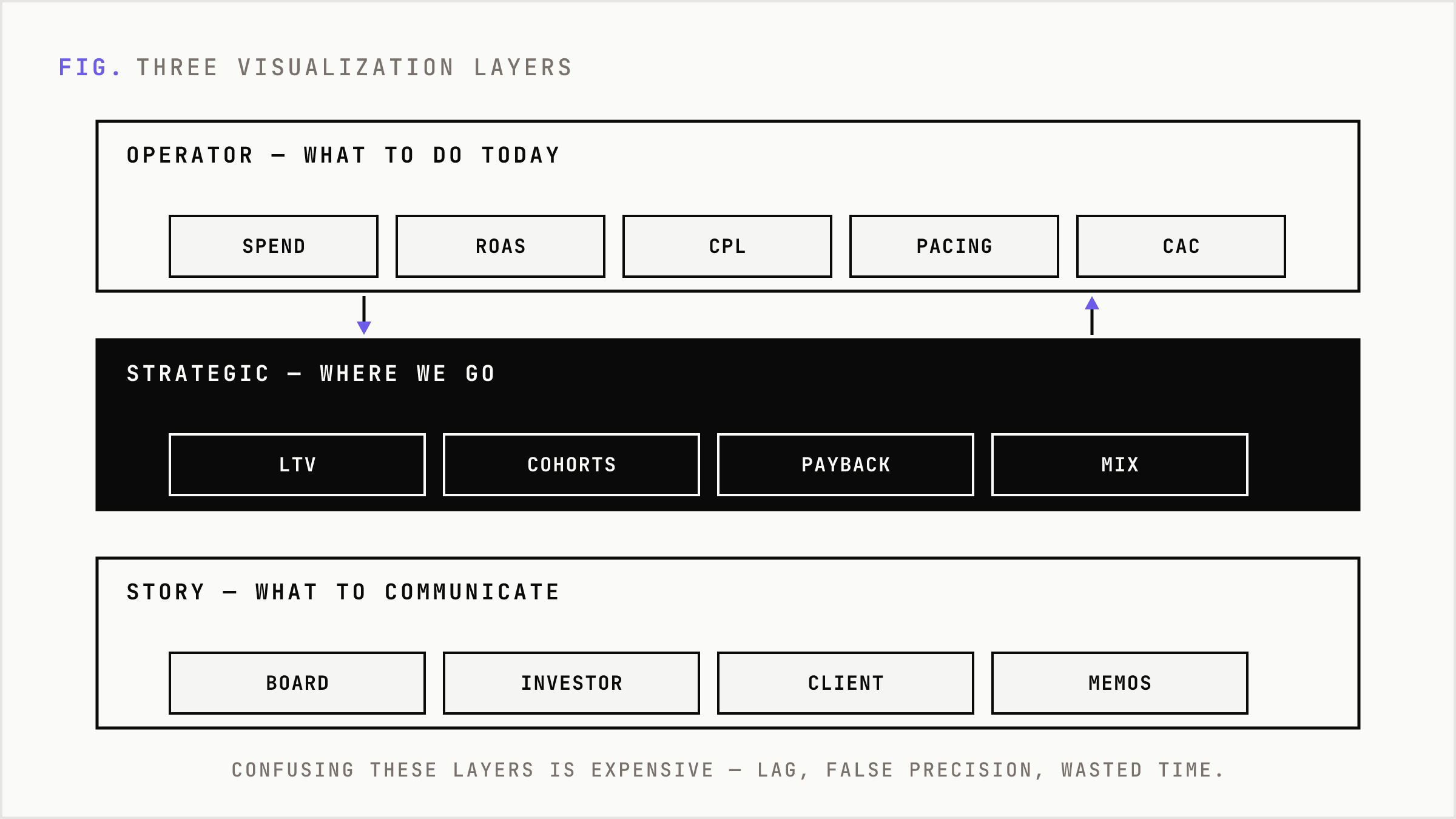
The operator layer answers what to do today. Spend, pacing, ROAS, CPL, CAC, pipeline creation, conversion rates, creative fatigue, audience saturation, landing page performance. This layer needs fast refresh, tight ownership, and enough trust that a channel manager can move budget without asking an analyst to validate every cell.
The strategic layer answers where the business is going. LTV, retention cohorts, payback period, marginal CAC, channel mix, incrementality, brand demand, sales cycle quality. This layer is slower, more modeled, and more politically sensitive. It determines whether the company hires, cuts, expands, or changes its go-to-market motion.
The story layer answers what to communicate. Board updates, investor narratives, client reports, benchmark studies, sales enablement, public research, and internal strategy memos. Here the winner is not the tool with the richest permission model. It is the tool that makes the argument legible.
Confusing these layers is expensive. A CMO who tries to run operators from a quarterly board dashboard gets lag. A performance marketer who tries to explain incrementality with a daily ad platform view gets false precision. A content team that uses enterprise BI to publish an interactive report often burns time on governance features the audience never sees.
The enterprise BI market is converging
The old buying logic was simple. Tableau was visual exploration. Power BI was Microsoft distribution. Looker was semantic modeling. Qlik was associative analytics. ThoughtSpot was search. Sigma was spreadsheet-native warehouse analytics.
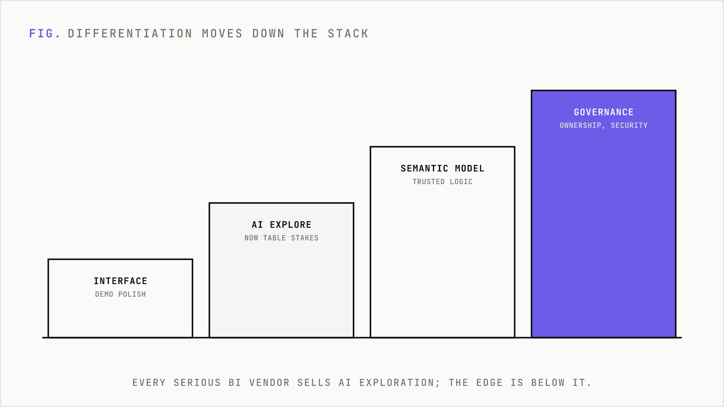
Those identities still matter, but the market is converging. Every serious BI vendor now sells some version of AI assisted exploration. Ask a question. Generate a chart. Summarize a page. Explain a variance. Trigger a workflow. The product surfaces are getting closer.
That does not mean the products are the same. It means the differentiation moved down the stack.
Power BI is strongest when the company already lives in Microsoft, Fabric, Teams, Excel, and Azure. Copilot can help create report pages and generate summaries, but its value depends on the underlying semantic model and admin configuration. Tableau remains strong for visual exploration and gains strategic pull when Salesforce context matters. Looker matters when governed definitions and Google Cloud alignment are central. Sigma is compelling when business users want spreadsheet interaction over live warehouse data. ThoughtSpot is sharp when search-native analytics is the desired user experience.
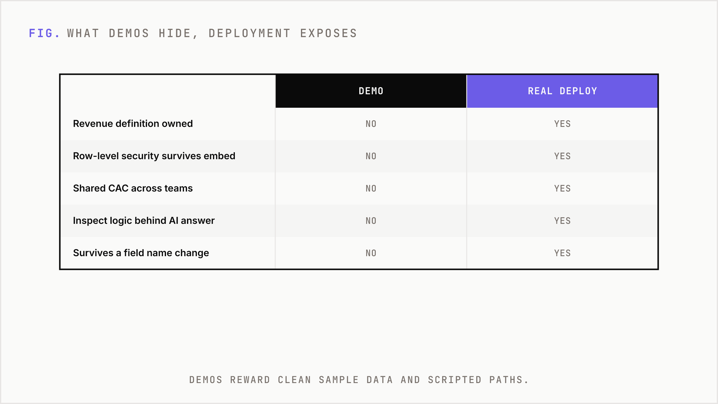
The buyer should not ask which interface looks best in a demo. Demos reward clean sample data and scripted paths. Real deployments expose the hard questions: Who owns revenue definition? Does row-level security survive embedding? Can finance and marketing use the same CAC metric? Can a user inspect the logic behind an AI answer? What happens when a field name changes?
AI changes the interface, not the physics
Natural-language analytics is useful. It is also unforgiving. A user asks, “Why did pipeline fall last week?” The system has to know what pipeline means, which stages count, how opportunities are dated, whether channel attribution is first touch or multi-touch, and which permissions apply to the user asking.
Without that structure, AI creates a faster path to bad answers. The failure mode is not a blank screen. It is a confident answer with plausible logic and weak grounding.
This is why semantic layers are becoming more important, not less. The more natural the interface becomes, the more formal the underlying definitions must be. If anyone can ask questions, the system needs stronger rules about what words mean.
The best AI analytics products expose reasoning. They show tokens, SQL, definitions, lineage, or intermediate logic. They do not ask the business to accept a black box because the response sounded fluent. In marketing, this matters because attribution is already a model, not a fact. Adding a conversational layer on top of ambiguous attribution can make the ambiguity harder to see.
No-code storytelling is not a BI substitute
Flourish, Datawrapper, and RAWGraphs are excellent because they are narrow. They help teams turn data into public communication. They are faster than engineering and lighter than enterprise BI. A media team can build an interactive map. A research team can publish a benchmark chart. A brand team can make a report feel alive.
But they do not replace governed BI. They are not built to be the source of truth for regional permissions, metric lineage, revenue reconciliation, recurring refresh failures, or audit trails. Their strength is communication. Their weakness is operational control.
This distinction matters for budget. Storytelling tools are often bought by marketing, content, communications, or research. BI platforms are bought through data, finance, IT, operations, or revenue leadership. They may both produce charts, but they clear different internal hurdles.
Code wins when the visual is the product
BI is optimized for repeatable business questions. Code libraries are optimized for control. If the chart is embedded in a SaaS app, part of a customer-facing experience, or central to a differentiated workflow, D3, Plotly, ECharts, Observable Plot, or Chart.js may be the better choice.
The same is true inside data science. Matplotlib, Seaborn, Altair, Plotly, and ggplot2 belong in notebooks, model evaluation, experimental analysis, and reproducible research. They are not trying to replace a CMO dashboard. They are trying to help technical users see patterns while building or testing something.
The substitution line is clear. If users need governed self-serve access, use BI. If users need a designed narrative, use storytelling tools. If users need custom interaction or statistical workflow, use code. If users need uptime and alerts, use observability tooling.
Most dashboard failures are not design failures
Bad dashboards usually look like design problems. Too many tiles. Too much color. Confusing filters. No hierarchy. Those issues matter, but they are symptoms.
The deeper failure is usually one of five things.
- Vanity metrics dominate because no one agreed on the decision the dashboard should support.
- Channel dashboards are siloed, so spend, behavior, and revenue never connect.
- Definitions differ across teams, creating political debates inside the numbers.
- Attribution is presented as truth rather than a model with assumptions.
- The dashboard explains what happened but not what should change.
A useful marketing dashboard has an operating theory. If CAC rises, who acts? If creative fatigue appears, what threshold triggers rotation? If paid search efficiency falls while branded demand rises, what budget move is allowed? If a cohort underperforms, which owner receives the signal?
Without that operating theory, visualization becomes internal theater. The team is not underinformed. It is overexposed to weak signals.
How to choose without wasting a quarter
Start with the decision, not the vendor list.
If the team needs fast internal dashboards and already works inside Microsoft, Power BI is the default shortlist. If the company values premium visual exploration and Salesforce integration, Tableau deserves attention. If governed semantic modeling on Google Cloud is central, Looker is a rational fit. If the business wants spreadsheet users working directly on warehouse data, Sigma is unusually well aligned. If the organization wants search-first analytics, ThoughtSpot is the sharper bet. If cost control and self-hosting matter, Metabase or Superset are credible. If analytics engineering wants BI-as-code, Evidence is purpose built.
For public reporting and editorial output, use Datawrapper or Flourish. For designer-exportable custom visuals, use RAWGraphs. For bespoke web visuals, use D3 or Observable Plot. For Python analytics, use Plotly, Matplotlib, Seaborn, or Altair. For R, use ggplot2. For real-time monitoring, use Grafana.
Then evaluate the boring things that decide success: data source fit, refresh needs, permissions, row-level security, semantic modeling, accessibility, cost model, ownership, and maintenance. Ask who fixes a broken refresh at 7 a.m. Ask who approves a metric change. Ask whether the dashboard can be retired when it stops being useful.
The market is expanding because the job is expanding
Visualization used to mean showing charts. Now it means building decision infrastructure. That expands the market in two directions.
Upstream, tools are moving into data modeling, semantic layers, governance, AI question answering, and workflow automation. Downstream, they are moving into embedded analytics, customer-facing reports, operational alerts, and narrative publishing.
This creates more specialization, not less. The winner is not one universal dashboard. The winner is a stack where each tool has a clear job and a clear owner.
For marketing leaders, the mandate is simple. Stop buying tools to make data look better. Buy systems that make decisions cheaper, faster, and more defensible. Connect spend to behavior. Connect behavior to revenue. Preserve the assumptions. Show the next action.
The chart is only the interface. The asset is the decision loop behind it.
FAQ
What is the best data visualization tool for marketing teams?
There is no single best tool. Power BI, Tableau, Looker, Sigma, and ThoughtSpot are strong for governed dashboards. Datawrapper and Flourish are better for public storytelling. D3, Plotly, and ECharts are better for custom interactive visuals.
Are AI analytics tools reliable?
They can be useful when the data model is governed, metrics are defined, and users can inspect the logic behind answers. Without a strong semantic layer, AI analytics can produce confident but incorrect responses.
Should marketing use open-source BI?
Open-source BI can work well when the team has technical ownership. Metabase, Superset, and Evidence can reduce license costs, but they still require hosting, security, modeling, maintenance, and support.
Why do marketing dashboards fail?
Most fail because they track activity without connecting it to decisions. Common issues include vanity metrics, siloed channel reporting, inconsistent definitions, weak attribution assumptions, and no clear owner for action.